Nobody watches a video they do not click, and nobody clicks a video whose still frame tells them nothing. The thumbnail is the whole pitch: one frame, una cara, one promise, seen at the size of a postage stamp on a phone. The clip itself can be the best five seconds you ever generated. If the still is a grey blur, nobody will ever know.
Earlier articles in this series covered the free video tier, cutting your first clip, adding sound, making loops, shooting vertical, and the zero-cost pipeline that assembles all of it in a day. This one is the packaging layer: how to pick one free still from your clip, and make it the reason someone presses play.
Veredicto rápido
Pick the frame with a face and a direction in it, not the sharpest frame and not the first frame. Crop it to the screen it will be seen on, keep the text to five words or none, and check it at thumbnail size before you post — if it does not read at 120 pixels wide, it does not read at all. A good still costs nothing: it comes from a clip you already made, on the free tier. The rule to remember is simple, because the thumbnail is the promise, and the clip has to keep it.
En esta guía
- 1. The click is decided before the play button
- 2. Pick the frame, not the first frame
- 3. The face test
- 4. Text on the still: less is more
- 5. Crop for the small screen
- 6. One clip, three thumbnails
- 7. The thumbnail checklist before you post
- Coste: a good thumbnail costs nothing
- 8. Consentimiento: la regla que lo decide todo
- Veredicto final
- FAQ
A still that sells vs a still that sits there
| A still that sits there | A still that sells | |
|---|---|---|
| Frame | The first frame, by default | The frame with the most happening in it |
| Face | Turned away or blurred | Visible, looking at something |
| Text | A paragraph crammed on top | Five words or none |
| Crop | The whole wide shot, shrunk | Cropped tight to the subject |
| At 120 px | A grey smear | Still readable |
The table is the whole argument in one place. A still that sits there is a frame you did not choose; a still that sells is a frame you picked on purpose. The clip is the product. The still is the shop window.
1. The click is decided before the play button
People do not browse videos. They browse stills. In a feed of a dozen clips, the eye goes to the one still that is clearest, brightest, and most human — and the finger follows the eye. The decision takes less than a second, and it is made at thumbnail size, on a phone, often while the person is doing something else. Your clip is competing with eleven other stills, not with eleven other clips.
That is why the thumbnail deserves the same care as the clip. A five-second clip takes minutes to generate and seconds to cut; the still takes thirty seconds to pick, and it decides whether anyone watches the minutes of work. Spend the thirty seconds. Open the clip, scrub through it, and look at it the way a stranger would: pequeño, fast, and without context.
The most common mistake is letting the platform pick. The default still is usually the first frame, and the first frame of a generated clip is usually the worst — the character mid-blink, the light still settling, the motion not yet started. Never ship the default. Picking the frame is the job, and it is the cheapest job in video.
2. Pick the frame, not the first frame
Scrub through the whole clip before you choose. The best frame is usually in the middle, where the movement has settled and the character is doing something: turning, reaching, smiling, looking at the camera. The beginning is a warm-up and the end is a wind-down. The middle is the scene.
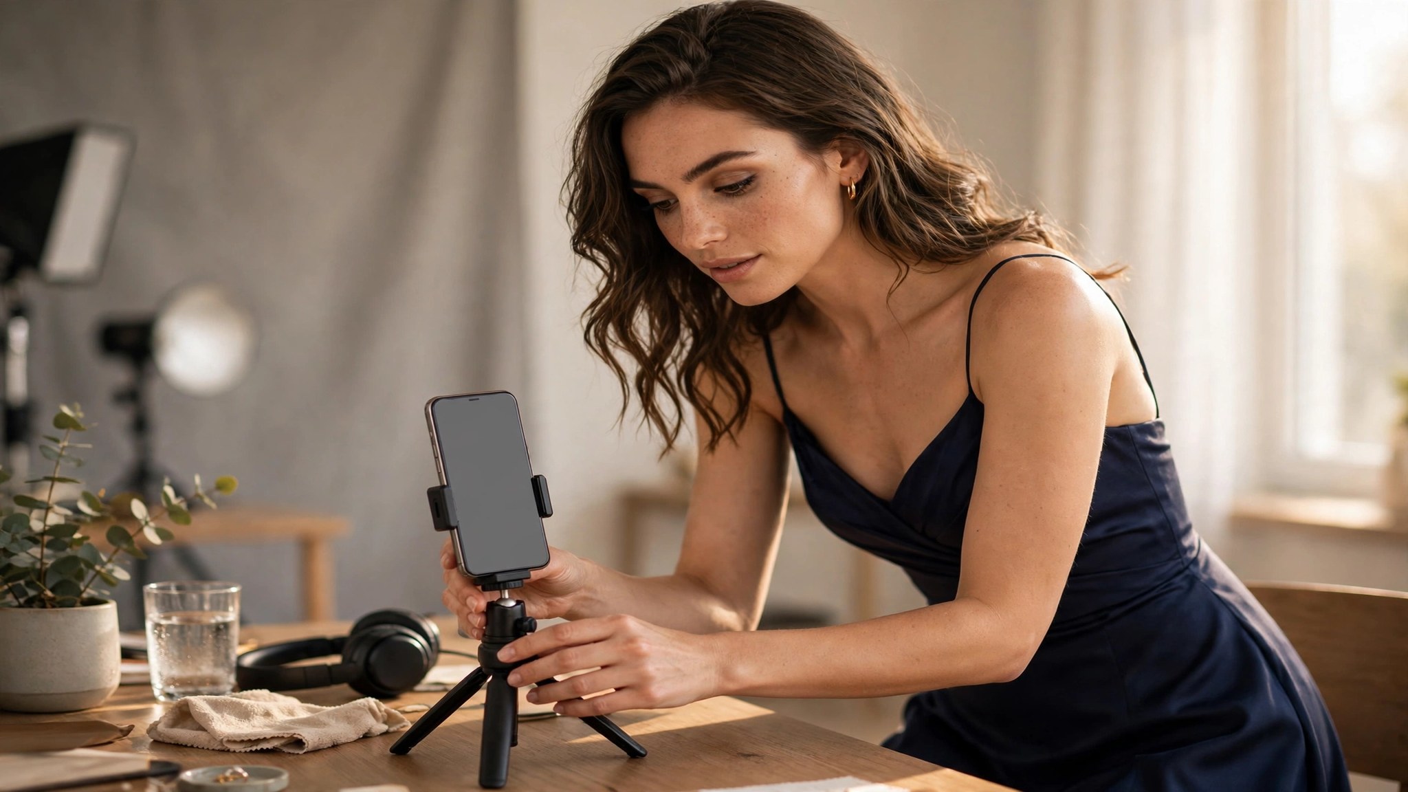
Judge frames by three things: a face, a direction, and a contrast. A face gives the still a person to look at. A direction — eyes looking somewhere, a hand reaching, a body turning — gives it a story. Contrast, light against dark or warm against cool, makes it visible at small size. A frame with all three is a thumbnail. A frame with one is a maybe. A frame with none is a skip.
Do not pick the frame you like most. Pick the frame a stranger would understand fastest. Your favourite frame is often the subtlest one, and subtlety dies at 120 pixels wide. The frame that reads in half a second — face, direction, contrast — beats the frame that rewards a careful look. Nobody gives a thumbnail a careful look. That is the whole job.
3. The face test
A face in the still is worth more than anything else in it. People look at faces first, and a face looking at the camera is the strongest single element a thumbnail can have. If the clip has a moment where the character looks at the lens, that is your thumbnail, even if another frame is prettier. The look is a hook; the prettiness is decoration.
Eyes matter more than the whole face. A frame where the eyes are open and aimed — at the camera, at another character, at something off-screen — reads instantly. A frame where the eyes are closed or the face is turned away reads as a mistake, even when it is a beautiful mistake. The test is simple: cover everything but the eyes. If the still still works, the eyes are doing the job.
One face is enough. Two faces split the attention, and a crowd at thumbnail size is noise. If the clip has two characters, crop to the one whose expression carries the scene, and let the other be implied. The still is not the clip; it does not have to show everything. It has to show one thing clearly.
4. Text on the still: less is more
Text on a thumbnail is a gamble. At full size it looks helpful; at thumbnail size it is often unreadable, and unreadable text is worse than no text — it looks like a smudge. If you add text, keep it to five words, in the largest weight you can stand, with a dark outline or a solid bar behind it. If the words do not fit in five, they do not belong on the still.
The best text is a label, not a sentence. One word for the mood, one for the scene, or nothing at all. The clip’s title does the explaining; the still does the inviting. A still that tries to explain is a still that fails at both jobs. When in doubt, leave the text off and let the face do the work.
Never put text over the face. It is the most common thumbnail mistake, and it ruins the one element that matters. Text goes in the empty space — the dark corner, the plain background, the sky. If there is no empty space, there is no room for text, and the answer is no text.
5. Crop for the small screen
Most people will see your thumbnail on a phone, in a feed, at roughly 120 pixels wide. Test at that size. Shrink the still to 120 pixels and look at it: can you still see the face, the direction, and the contrast? If not, crop tighter. The wide shot that looks great on a laptop is a grey rectangle on a phone. Crop to the subject, and let the background go.
Vertical clips need vertical thinking. A 9:16 clip cropped to a 16:9 thumbnail loses the top and the bottom, which is usually where the face is. If the platform shows a wide thumbnail, pick a frame where the face sits in the middle band, or crop the still itself to the wide shape and check the face survives. The article on vertical video covered the clip; this is the still catching up with it.
Crop with the eyes in mind. The eyes should sit near the top third of the still, not buried in the middle. A face at the bottom of the frame reads as falling out of it. A face near the top reads as looking at you. The rule is the same as in the clip itself: the eyes lead, everything else follows.
6. One clip, three thumbnails
Do not settle for one still. Pick three frames from the same clip — the face, the action, the mood — and compare them at thumbnail size. The one that reads fastest wins. The comparison takes two minutes, and it is the most reliable test in this article, because you are judging the stills the way a stranger will judge them: pequeño, fast, and side by side.
Keep the losers. A frame that loses as a thumbnail may win as a poster, a profile image, or the cover of a set. The three frames are three different promises for the same clip, and the promise you do not use today is the one you use next week, when the same clip goes out again in a different feed. Nothing is wasted if you save it with a name you can find.
Rotate, do not repeat. The same clip with the same still, posted twice, is the same post. The same clip with a new still is a new post, and it reaches the people who scrolled past the first one. The thumbnail is the cheapest way to re-release a clip, and it costs nothing but the thirty seconds it takes to pick a different frame.
7. The thumbnail checklist before you post
Before you post, run the checklist. Uno, is this the best frame, or just the first frame? Two, is there a face, and are the eyes open and aimed? Three, is there a direction — something happening, not just something standing? Four, does it read at 120 pixels wide? Five, is the text five words or fewer, and is it off the face? Six, is the crop tight to the subject? If any answer is no, fix it before you post. The checklist takes a minute, and it is the difference between a clip that gets watched and a clip that gets scrolled past.
Seven, does the still promise what the clip delivers? A still that promises a scene the clip does not have will get the click and lose the viewer, and a viewer who feels tricked does not come back. The thumbnail is the promise, and the clip has to keep it. A modest still for a good clip beats a spectacular still for a clip that cannot live up to it, every time.
Coste: a good thumbnail costs nothing
The thumbnail is free. It comes from a clip you already generated, and the clip itself can be free: this site’s free tier lets you generate video at no cost and with no credit card, although starting generation requires a Google login. Picking the frame costs nothing, cropping it costs nothing, and testing three frames costs nothing. The whole article, done properly, spends zero credits.
The numbers only start if you want more clips to pick from. A 5-second video template is 351 créditos: about $7.02 en la $19.99 pack for 1,000 créditos, about $4.21 en la $59.99 pack for 5,000 créditos. An 8-second template is 561 créditos: about $11.22 y $6.73. A standard image is 6 créditos: about $0.12 y $0.07. El $19.99 y $59.99 packs are one-time purchases with credits added at once, and the annual packs of $119.88 y $359.88 are paid once and release credits monthly across twelve months. Precios comprobados 13 Nov. 2026.
The expensive mistake is generating a new clip because the old one’s thumbnail failed. A new 5-second clip is 351 créditos; a new still from the old clip is free. Pick three frames, test them at thumbnail size, and only generate again when the clip itself is the problem. The thumbnail is the cheapest fix in video, and it is free.
8. Consentimiento: la regla que lo decide todo
Genera solo imágenes y videos de ti mismo, or of fictional adult characters. Never generate a clip of a real person without their consent, and never use a thumbnail to imply a scene the clip does not contain. A still that promises a real person doing something they never did is not a thumbnail — it is a lie with a play button on it, and the line stays exactly there.
The rule applies to the face in the frame as much as to the body. A fictional adult character, generated from scratch, is yours to show. A real person’s face, used without permission, is not — no matter how good the frame is. The thumbnail is the promise, and the promise is only honest when the character in it is yours to show.
Veredicto final
The thumbnail is the whole pitch: pick the frame with a face, a direction, and contrast — usually from the middle of the clip, not the first frame — crop it tight, and test it at 120 pixels wide.
It costs nothing — the still comes from a clip you already made — and it is the cheapest fix in video: pick three frames, compare them small, and only generate again when the clip itself is the problem. Above all, the still must promise only what the clip delivers.
FAQ
Should I use the first frame of the clip as the thumbnail?
Almost never. The first frame is usually the weakest — the character mid-blink, the light still settling, the motion not yet started. Scrub to the middle and pick the frame with a face, a direction, and contrast.
How much text should go on a thumbnail?
Five words or none. More than that is unreadable at thumbnail size. Never put text over the face; use the empty space instead.
How do I test a thumbnail?
Shrink it to about 120 pixels wide, the size it will appear in a phone feed. If the face, the direction, and the contrast still read, it passes. If it becomes a grey smear, crop tighter.
Can I use a different frame for the same clip later?
Sí, and you should. A new still is a new post for the same clip, and it reaches the people who scrolled past the first one. Keep the frames you did not use.
Does a thumbnail cost credits?
No. The still comes from a clip you already made, and picking it is free. Video generation itself can be free on this site’s free tier, with a Google login required to start.
¿Puedo hacer porno con IA de una persona real?
No. Genera solo imágenes de ti mismo, o de adultos ficticios. Generar una imagen de una persona real sin consentimiento no está permitido.